Growing up in Baltimore, the Orioles were my first sports love. I first got hooked in 1983 when they won the World Series … coincidentally, the same year the Colts played their last season in Baltimore (Bob Irsay, curse thy name!). The “worst to first” team in 1989 renewed my love of the franchise, and I spent a substantial amount of my remaining childhood years watching the O’s on Home Team Sports.
After graduating high school in 1994, I moved to Nashville to attend Vanderbilt, and my relationship with the team suffered. Those were early Internet days, which made it hard to keep up with the team. Plus, Nashville is smack dab in the middle of National League country (Braves, Cubs, Reds, Cardinals, etc.), which ruled out any local media coverage. Nevertheless, I continued to quietly yell “O” during the National Anthem, and the Orioles Magic song remained stuck in my head.
If you’re unfamiliar with Orioles Magic, do yourself a favor and listen here:
Forty years after they won their last World Series, the O’s are the top American League seed in this year’s playoffs. One thing the 1983 and 2023 teams have in common is their logos. The cartoon bird logo was created by designer Stan Walsh in 1966. The O’s have several trademark registrations for the logo:
| US Reg. No. 840662 | US Reg. No. 840661 | US Reg. No. 1214055 |
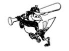 |
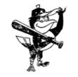 |
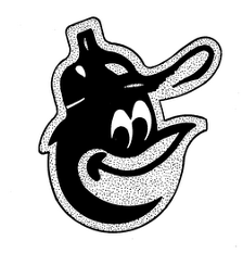 |
In 1989, the O’s replaced the cartoon bird with the so-called “ornithologically correct” bird:
| US Reg. No. 1649971 | US Reg. No. 1793382 |
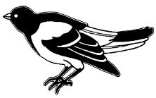 |
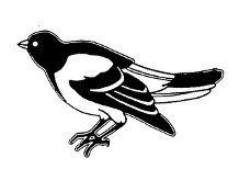 |
In 2012, the O’s came to their senses and ditched the lifelike bird. They’ve used the cartoon bird ever since.
Baseball is a sport with a long history of superstitions and rituals. Maybe that applies to logos too? If so, the cartoon bird might be the magic ingredient the O’s need to win their fourth World Series title.
Trust Tree Legal, P.C.
Mailing address:
798 Berry Road #41400
Nashville, TN 37204
Meetings by appointment only.
Attorney advertising.
Prior results do not guarantee a similar outcome.